Last week the IBM Verse Calendar (Cloud only for now..) got a major redesign. It had been announced some time ago, finally it has been released and I must say, well done IBM. It has a nice design and the enhanced functionality helps organizing your “calendar day”.
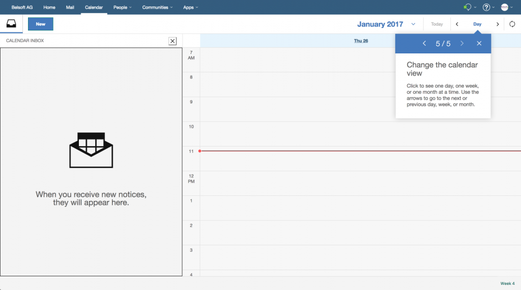
When logging in the first time after an upgrade/update you get the tour of “what’s new” and this is where most screenshots are from.
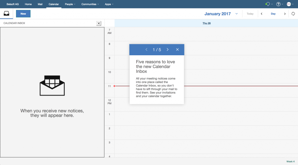
Five reasons to love the new Calendar Inbox
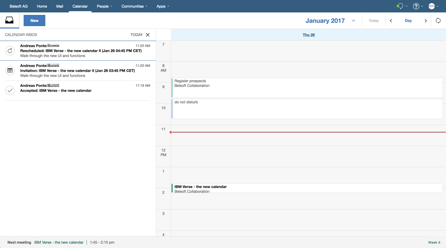
Of course the Inbox, where you will find invitations, meeting notices and so on.
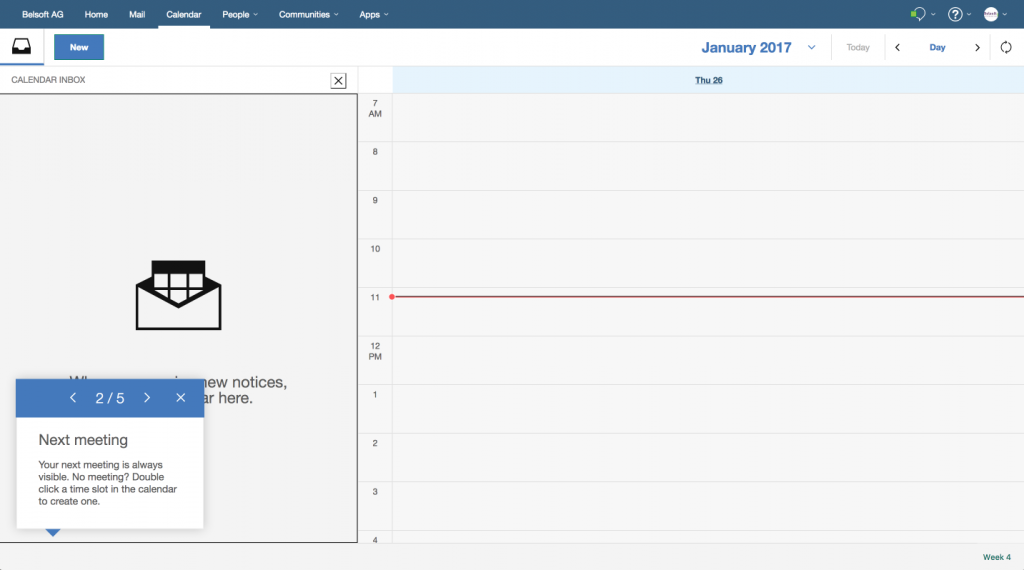
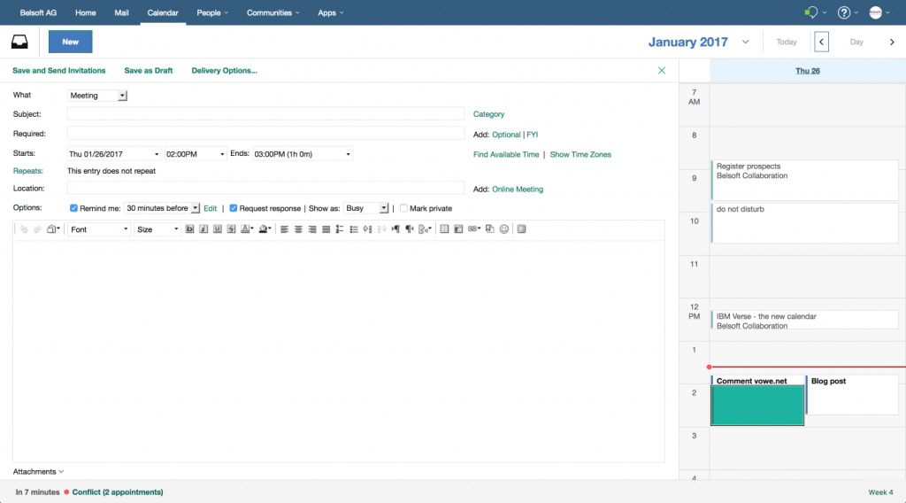
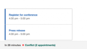
The footer, where you see notification(s) of your next meeting(s), no matter if the same day or in the future. It will change to a minute count-down when the meeting is closer or notify you of further entries, i.e. «first appointment tomorrow». If there is a conflict, two or more meetings starting at the same time, you can see what is scheduled with one click. -> I really like this one
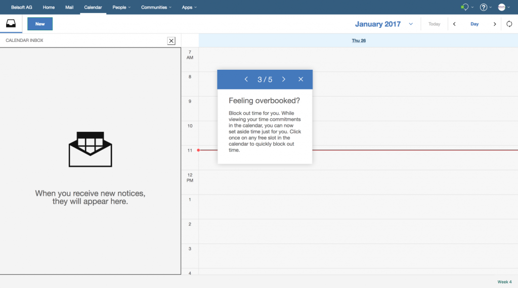
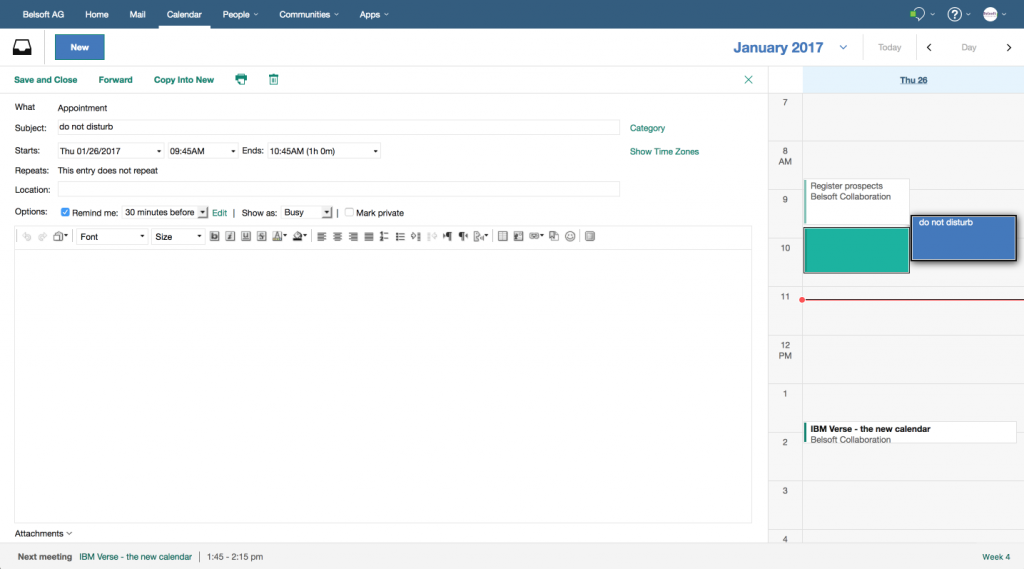
Block out time for yourself by simply clicking on a free time slot. It will create a calendar entry, neither appointment nor meeting, rather a reminder for yourself.
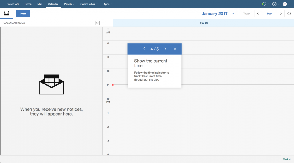
The narrow red line will show you the current time of the day
and of course you can change the view and choose the day, week or month overview.
Detailed views:
Now eagerly awaiting the on premises release of this new Calendar, which I think could give IBM Verse a new push.
Leave a Reply